Bridges Health
In our project to redesign the visual system and branding strategy for Bridges Health Winona, we aimed to achieve aesthetic excellence while creating a transformative brand narrative. This endeavor extended beyond local boundaries, preparing the organization to make a significant impact as a non-profit at both national and international levels. Our process began with comprehensive research to deeply understand Bridges Health’s core values and the unique challenges faced by diverse communities worldwide. This led to the development of a visual system that resonates universally, well-positioned to make a profound global impact.
Client: Timm, Jen R
Associate Professor of Nursing at Winona State University
Timeframe: 9/08 – 9/27 2023
Type: Client Work
Collaborators: Alex Trainor, Pierre Gage
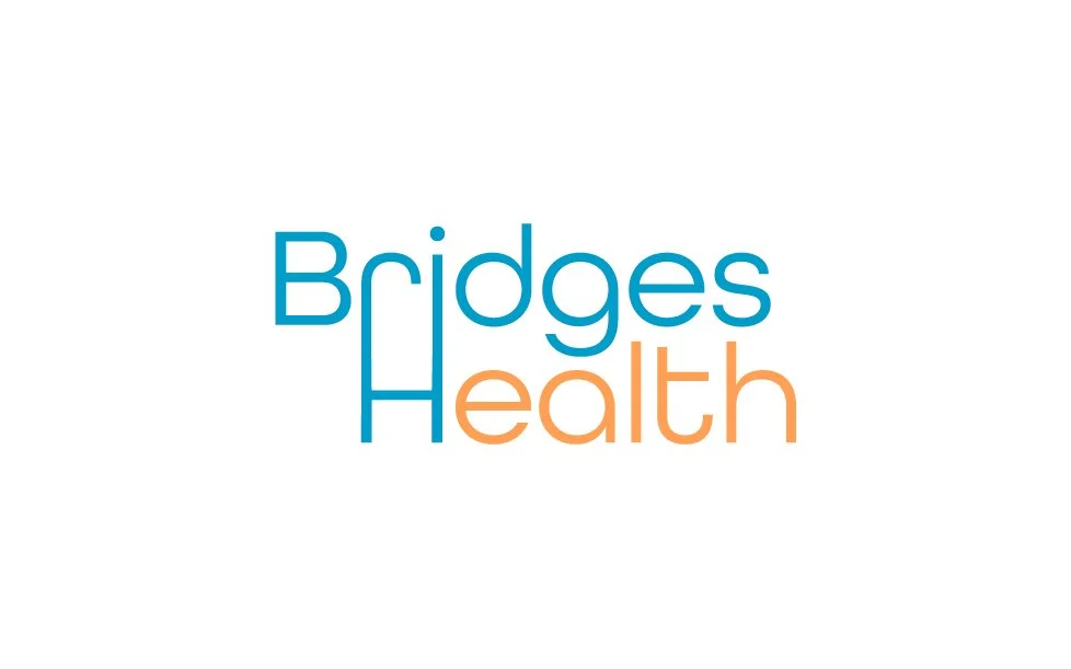
Original Logo

Our Process
Play
In this initial stage, we gathered all the necessary information to understand the brand and its vision. This involved brainstorming, creating sketches, and developing rough ideas for the logo. It's a phase of exploration and creativity where we laid the foundation for the design process.
Refine
After generating initial concepts, we worked closely with the client to get their feedback and refine our ideas. This step involved refining the design based on the client's feedback. We worked carefully to fine-tune the design, ensuring the final logo perfectly represented the brand’s identity and values.
Execute
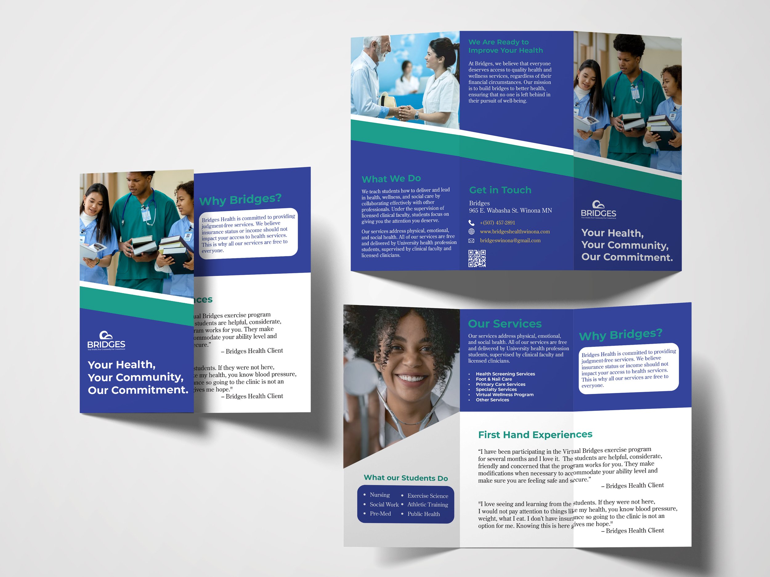
Once the logo was finalized, we moved on to the execution phase. This involved producing all the necessary collateral and other rebranding services that was required. By creating marketing materials, updating the website, and developing promotional items, we ensured a cohesive and comprehensive rollout of the company’s new identity.
Play Stage


What makes our rebrand unique?

-
The logo uses a harmonious blend of deep blue and teal, evoking a sense of trust, calm, and stability. This color scheme is both modern and approachable, reflecting the organization's commitment to health and community.
-
The tagline "Your Health, Your Community, Our Commitment" encapsulates the core values of BRIDGES. It emphasizes a collective approach to health, highlighting the importance of community support and the organization's dedication to providing reliable healthcare services.
-
The new logo pays homage to the original "Bridges Health" logo by maintaining its foundational elements. However, the updated design drops the word "Health" to avoid redundancy and focuses on a broader scope. This change underscores the organization's expanded mission to not only address health but also to foster stronger community connections and support.
Execution